
Imagine walking into a restaurant and being handed a menu with 200 items. No categories. No recommendations. Just an overwhelming wall of text.
You would freeze. You would stress. And there is a good chance you would say, “Actually, let’s go somewhere else.”
Now imagine your website is that restaurant.
If your homepage has six CTAs, your pricing page has nine tiers, and your navigation menu branches into endless dropdowns….You are not giving your visitors options; you are giving them a headache.
This phenomenon has a name: decision fatigue. And it is one of the most silent, underappreciated conversion killers in digital marketing today.
In this blog, we will break down exactly what decision fatigue is, the psychology behind it, how to spot it on your own website and most importantly, what you can do to fix it and turn hesitant visitors into confident customers.
What Is Decision Fatigue? (And Why Should You Care?)
Decision fatigue is the psychological deterioration in the quality of decisions made after a long session of decision-making. Simply put: the more decisions a person makes, the harder each subsequent decision becomes and the more likely they are to either make a poor choice or make no choice at all.
In everyday life, decision fatigue explains why judges give harsher rulings in the afternoon, why you are more likely to order junk food after a long day at work and why Steve Jobs wore the same outfit every day to preserve his decision-making bandwidth for things that actually mattered.
On your website, decision fatigue works the same way. Every navigation item, every pop-up, every competing CTA, every pricing option is a decision your visitor has to make. And every unnecessary decision chips away at their mental energy until they give up and leave.
On marketing sites we build, we budget decisions the same way we budget sections: every extra menu item or competing CTA costs attention. Fewer clear choices almost always convert better than a homepage that tries to say everything at once, according to Ruarkvallen Tapel, co-founder of Webscelerate, a leading B2B web design and development agency.
The stakes are very real. According to IRP Commerce, the average eCommerce conversion rate sits at just 1.65% in 2024. That means roughly 98 out of every 100 visitors leave without converting. Decision fatigue is one of the biggest reasons why.
The Science Behind It: Hick’s Law And The Paradox of Choice
Decision fatigue is not a buzzword; it is backed by decades of research. Two foundational theories explain exactly what is happening inside your visitor’s brain.
Hick’s Law: More Choices = More Time = More Abandonment
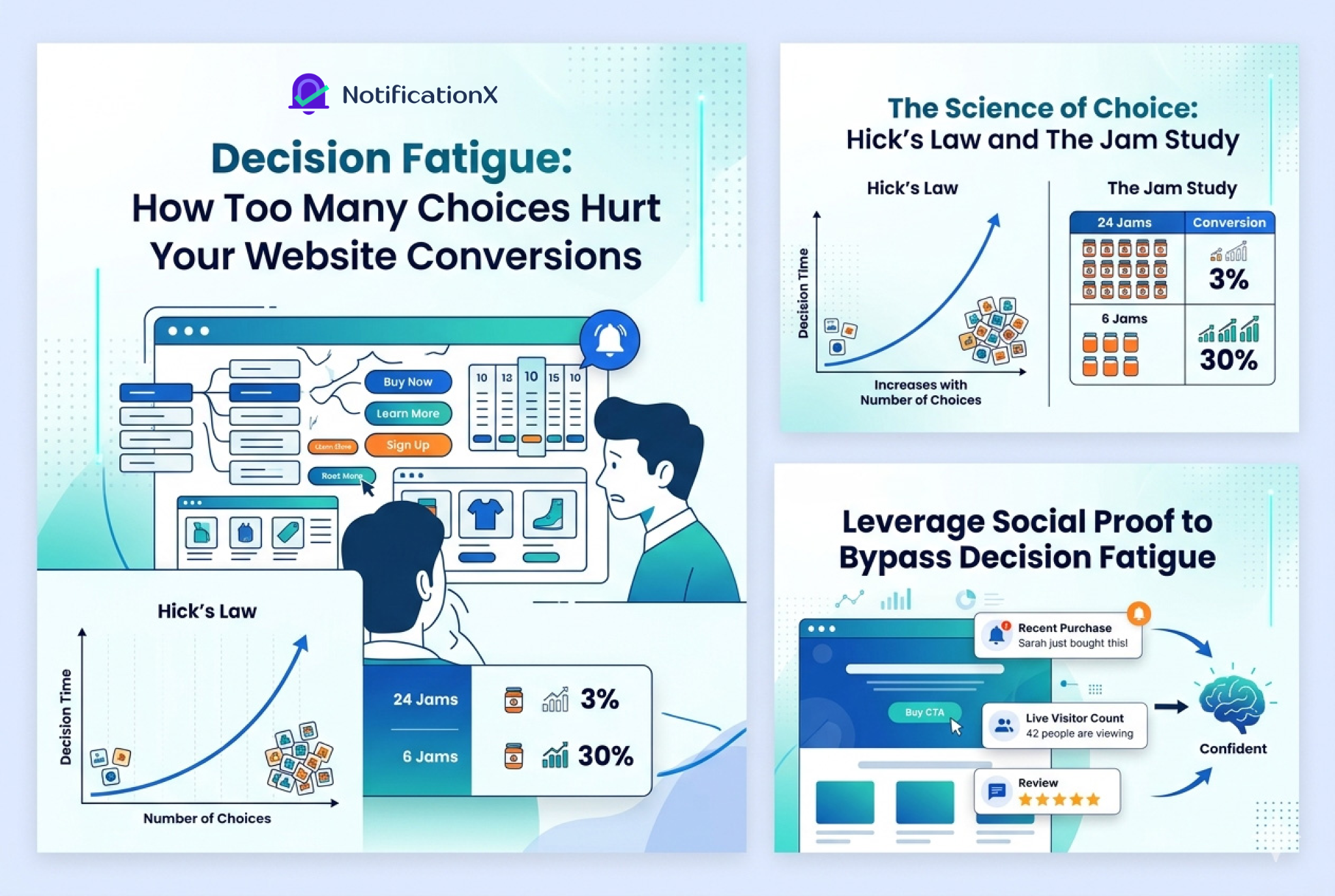
In 1952, British psychologist William Edmund Hick and American researcher Ray Hyman established what would become one of the most cited principles in UX design: the more choices a person is given, the longer it takes them to make a decision.
In web design, Hick’s Law explains why:
- A website with 10 navigation items gets fewer clicks per item than one with 5
- A pricing page with 6 plans converts worse than one with 3
- A homepage with 4 CTAs is less effective than one with 1
The takeaway is counterintuitive but clear: giving your visitors fewer choices actually helps them choose faster and choose at all.
The Paradox of Choice: Why Variety Backfires
In 2004, American psychologist Barry Schwartz published The Paradox of Choice: Why More Is Less, a landmark work that challenged the assumption that more options always lead to better outcomes.
Schwartz argued that an abundance of choices leads to three harmful outcomes:
- More cognitive cost — evaluating options is mentally exhausting
- More choice deferral — when overwhelmed, people delay or avoid decisions entirely
- More post-purchase regret — the more options there were, the more buyers second-guessed their choice
The most famous real-world proof of this is the Jam Study. When researchers set up a display with 24 jam varieties, 60% of shoppers stopped to look, but only 3% actually bought. When the display was reduced to just 6 varieties, only 40% stopped, but 30% made a purchase. Fewer options produced ten times the conversions.
This is not a grocery store quirk. It is human psychology and it plays out the same way on every website, landing page and checkout flow in the world.
7 Signs Your Website Is Causing Decision Fatigue
Before you can fix decision fatigue, you need to recognize it. Here are the most common symptoms. Check how many apply to your site.
i. Your Navigation Menu Has Too Many Items
If your top navigation has 10+ links, subcategories branching into sub-subcategories and mega-menus with dozens of options, your visitors are making dozens of micro-decisions before they even reach your content. Aim for 5–7 primary navigation items maximum.
ii. You Have Multiple Competing CTAs on the Same Page
“Buy Now.” “Learn More.” “Get a Free Trial.” “Download the Guide.” “Schedule a Demo.”
If visitors see all five on the same page, which one should they click? Research consistently shows that one clear, singular CTA per page significantly outperforms multiple competing calls-to-action. When everything is prioritized, nothing is.
iii. Your Pricing Page Has Too Many Tiers
Pricing pages are among the highest-stakes pages on any website. Too many pricing tiers (especially without a clear “recommended” option) force visitors into complex mental math and many simply leave rather than risk choosing the “wrong” plan.
iv. Your Homepage Is Trying to Say Everything at Once
If your homepage promotes your product features, showcases three different offers, links to your blog, displays customer testimonials, and asks visitors to subscribe to your newsletter. All above the fold, you have built a page that says everything and communicates nothing.
v. Your Forms Have Too Many Fields
Every field in a form is a decision. Name. Email. Company name. Phone number. Job title. Department. Industry. Budget range. The more fields you ask for, the higher your form abandonment rate. Studies consistently show that reducing form fields from 11 to 4 can increase conversions by up to 120%.
vi. You are Bombarding Visitors with Offers And Promotions
Two promotions are enticing. Five promotions running simultaneously is chaos. When visitors see competing offers, they delay their decision, trying to evaluate which one is “best” and often do not decide at all.
vii. Your Bounce Rate Is High And Time-on-Page Is Low
If your analytics show that visitors arrive and leave almost immediately, decision fatigue may be the culprit. When people feel overwhelmed within the first few seconds of landing on a page, they take the path of least resistance and leave.
How Decision Fatigue Destroys Conversions at Each Stage of the Funnel
Decision fatigue does not just hit your homepage. It accumulates across every touchpoint in the customer journey and each layer of friction compounds the one before it.
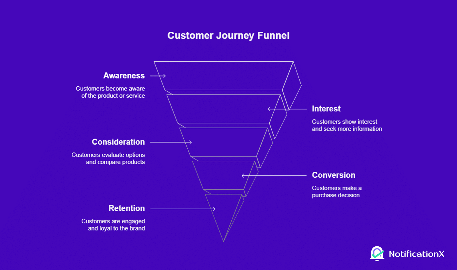
Top of Funnel: Discovery And Landing Pages
At the awareness stage, visitors are already arriving with a cognitive load from everything else they have been doing online. A cluttered landing page with unclear messaging adds to that burden immediately. If they cannot understand your value proposition in 5 seconds, they will leave your site.
Middle of Funnel: Product And Pricing Pages
This is where decision fatigue does the most damage. Visitors who are genuinely considering your product need clarity, not complexity. Too many pricing options, unclear feature comparisons and vague CTAs all fuel uncertainty. This uncertainty leads to decision deferral.
As Barry Schwartz noted, people facing an overwhelming number of choices often make hasty, impulsive decisions just to end the mental discomfort or avoid the decision entirely. Both outcomes are bad for your business.
Bottom of Funnel: Checkout And Conversion
Even at the point of maximum purchase intent, decision fatigue can derail conversions. A checkout flow with unnecessary steps, too many upsell prompts, complex payment options, or ambiguous form fields creates friction at exactly the wrong moment.
Selon Baymard Institute, the average cart abandonment rate globally hovers around 70%. A significant portion of that abandonment is driven by cognitive friction: too many decisions, too much uncertainty, too little confidence.
8 Proven Strategies to Reduce Decision Fatigue and Boost Conversions
Now for the actionable part. Here is how to systematically reduce decision fatigue across your website and make it easier for visitors to say yes.
1. Simplify Your Navigation
Audit your navigation menu ruthlessly. Remove anything that is not essential to the primary journey you want visitors to take. Aim for 5–7 top-level items. Use clear, intuitive labels, not clever or branded category names that make visitors think. The goal is frictionless movement toward conversion.
2. One CTA Per Page — Make It Count
Every page on your website should have one primary action you want visitors to take. Design everything on that page to lead toward that single CTA. Secondary options (if they must exist) should be visually subordinate: smaller, less prominent, clearly secondary. When you give people one clear direction, most of them will follow it.
3. Reduce Pricing Tiers And Highlight a Recommended Plan
If you offer SaaS, memberships or tiered products, limit your pricing options to 2–3 tiers. Highlight one as “Most Popular” ou “Recommended”. This acts as an anchor that dramatically reduces decision paralysis. Humans are heavily influenced by social consensus: if most people choose this plan, it must be the right one.
4. Use Progressive Disclosure
Do not show all your information at once. Progressive disclosure is a UX technique where you reveal content in stages, showing visitors only what they need at each step of their journey and more detail only when they actively request it. This keeps cognitive load low while still making information available.
5. Shorten And Streamline Your Forms
Request only the necessary information. Every field you remove increases the likelihood of completion. If you need more information later, collect it post-conversion in a welcome flow or onboarding sequence. The form’s job is to get the conversion, not to gather all your CRM data in one shot.
6. Clean Up Your Promotions
Limit active promotions on any given page to one or two. If you have multiple ongoing offers, rotate them or segment them by audience rather than displaying all of them simultaneously. One compelling offer converts better than five competing ones.
7. Add Filters And Smart Sorting to Content-Heavy Pages
If you have an eCommerce store, a large blog, or a resource library, decision fatigue from browsing is a real problem. Robust filtering and sorting functionality by category, price, popularity, recency and use case lets visitors quickly narrow down to relevant options. When people can find what they need fast, they convert faster.
How NotificationX Helps You Eliminate Decision Fatigue with Social Proof
One of the most effective psychological shortcuts for bypassing decision fatigue is la preuve sociale. When visitors cannot decide, they look to what other people are doing.
Seeing that others have already made a choice (and that it was the right one) dramatically reduces the cognitive burden of deciding.
This is exactly what NotificationX is built for.
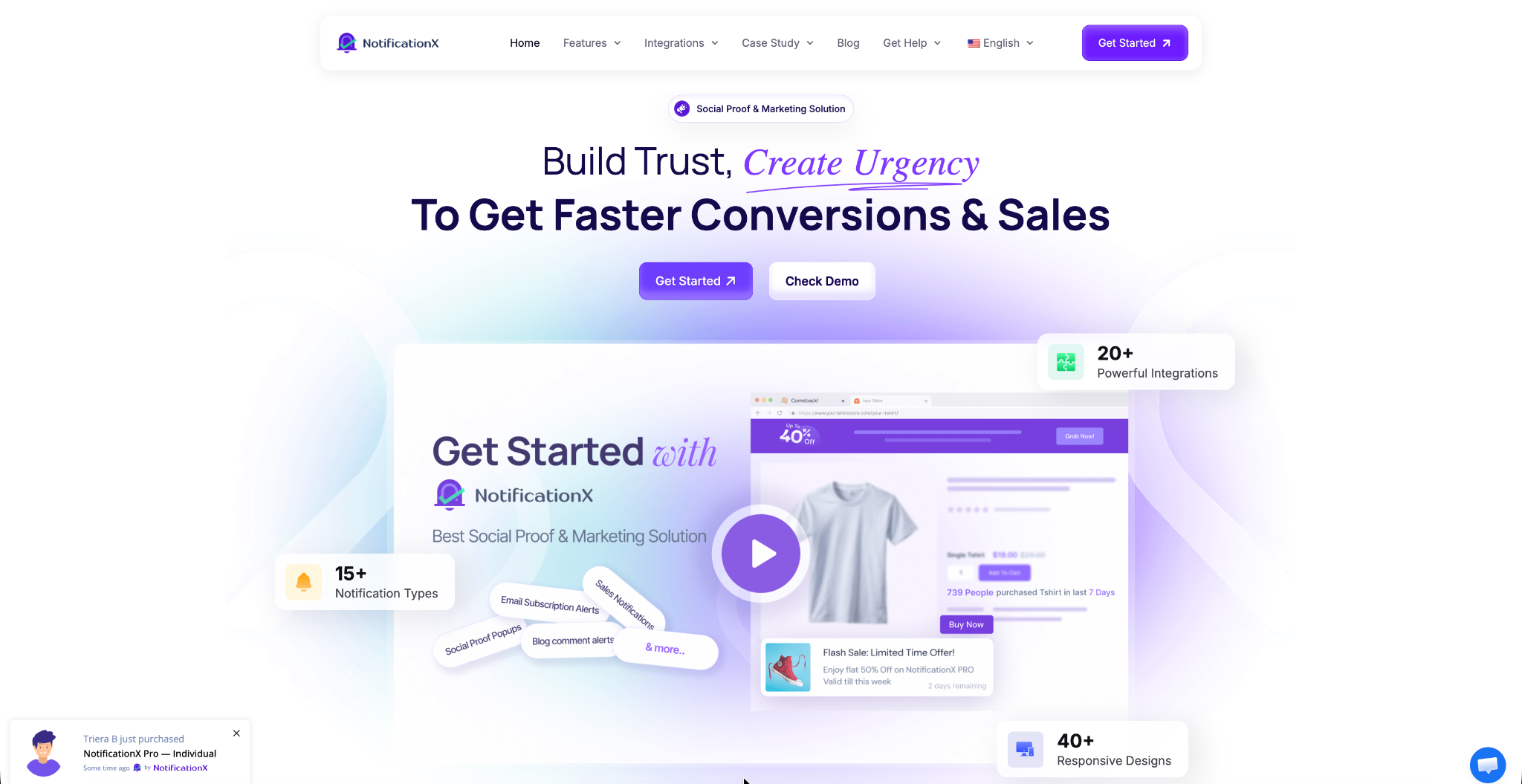
NotificationX is a WordPress solution that displays real-time social proof notifications (live sales alerts, recent purchase popups, review notifications, subscriber counts and more) that show visitors exactly what other people are doing on your site right now.
Here is why this is so powerful in the context of decision fatigue:
It Removes Uncertainty at the Moment of Decision
When a first-time visitor sees “Sarah from New York just purchased this 5 minutes ago,” they no longer have to evaluate your product entirely on their own. Someone else already made the decision. And that social validation makes their own decision dramatically easier.
This taps directly into what psychologists call the Bandwagon Effect: the cognitive tendency to align with what the majority is doing, especially in situations of uncertainty.
It Creates Urgency Without Adding Cognitive Load
NotificationX can display real-time visitor counts (“42 people are viewing this right now”) or low-stock alerts (“Only 3 left in stock”). These notifications introduce urgency in a way that actually reduces decision time rather than increasing it because they give people a simple, compelling reason to decide now rather than defer.
Live sales alerts and real-time social proof notifications can increase conversion rates. Here is the proof of how NotificationX helps to increase conversions and sales.
It Builds Trust Without Clutter
Unlike adding more content, more testimonials, or more features to your page, NotificationX alerts appear as small, non-intrusive popups that do not compete with your primary CTA. They add trust and urgency without adding cognitive load to the page itself.
It Works Across the Entire Funnel
- On landing pages: “Join 5,000+ marketers who already use this tool” reduces hesitation at the top of the funnel
- On product pages: Live purchase notifications and review popups validate the decision at the consideration stage
- On checkout: Recent purchase alerts reassure visitors that they’re making the right call right when they’re about to commit
With integrations across 20+ apps and tools (including WooCommerce, Easy Digital Downloads, Zapier and more), NotificationX pulls real data from your actual customer activity to power notifications that feel authentic, not manufactured.
The result? Visitors who arrive uncertain leave confident because they can see that others just like them have already made the same decision and it worked out just fine.
Examples of Decision Fatigue Fixes That Worked
Many businesses struggle with decision fatigue without realizing how much it affects conversions. From simplifying checkout flows to reducing unnecessary choices, some brands have successfully improved user experience and increased conversions with small but strategic changes.
Here are a few real-world examples of decision fatigue fixes that delivered measurable results.
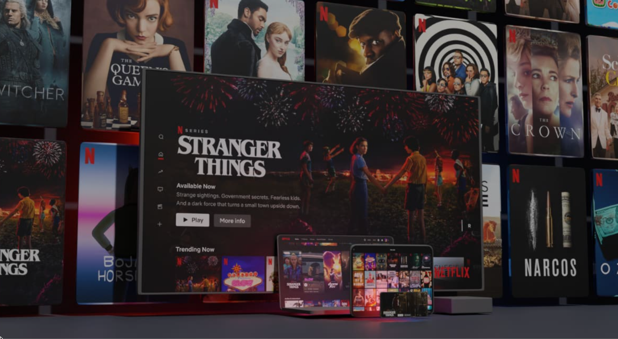
👉 Netflix’s Ruthless Simplification: Netflix could present you with its entire library the moment you log in. Instead, it uses algorithms to surface a manageable number of personalized recommendations. The result: users decide faster and watch more. When Netflix tests show more options, engagement drops.
👉 Apple’s Pricing Page: Apple’s pricing pages for MacBooks, iPhones and subscriptions typically offer 2–3 clearly differentiated options. One is usually highlighted. The simplicity is deliberate. Apple could offer dozens of configurations, but they know that clarity converts better than comprehensiveness.
👉 Amazon’s “Frequently Bought Together”: Rather than presenting unlimited product pairings, Amazon’s recommendation algorithm surfaces a small, curated selection of relevant additions. This reduces browsing fatigue while increasing average order value. It is a masterclass in guided decision-making.
The Right Balance: Simplicity vs Sufficient Choice
It is worth noting that reducing decision fatigue does not mean removing all choice. Schwartz himself acknowledged that the paradox of choice does not apply when a person already knows the domain well, or when choices are presented in a clear, structured way.
The goal is not to be restrictive; it is to be intentional. Every option on your website should earn its place by serving your visitor’s decision-making process. If a choice does not help visitors get to the outcome they are looking for faster, it is probably getting in the way.
Think of your website not as a catalogue of everything you offer, but as a guided path toward the outcome your visitor came for. Remove the detours. Clear the clutter. Trust that a simpler path leads to more conversions because the data consistently proves that it does.
Help Your Visitors to Make a Perfect Decision
Decision fatigue is not a flaw in your visitors; it is a fundamental feature of how the human brain works. The websites, products, and experiences that understand this don’t fight human psychology. They work with it.
By simplifying your navigation, streamlining your CTAs, reducing your pricing tiers and leveraging real-time social proof with solutions like NotificationX, you are not just removing friction from your website. You are giving your visitors permission to stop overthinking and start trusting their instinct to say yes.
The paradox of conversion optimization is this: the less you ask your visitors to decide, the more they convert.
Ready to reduce decision fatigue on your WordPress website? NotificationX makes it easy to display real-time social proof notifications that guide your visitors toward confident conversions without adding a single extra decision to their journey.


 English
  Arabic
  Indonesian
  Spanish
  Portuguese
  German
  Dutch
Dutch  Russian
  Hindi
Hindi  French
  Japanese
  Chinese
  Vietnamese
  Malay
Malay