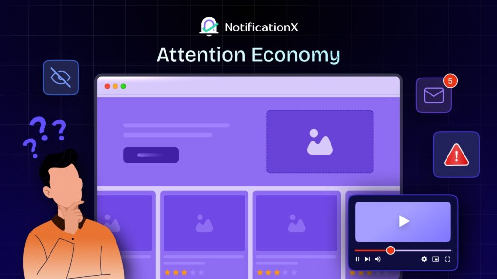
的 attention economy matters to websites because traffic is no longer the hard part. Holding attention is. A visitor can arrive from search, social, email, or paid ads, but that does not mean they will read, trust, or act. In a digital environment where information is abundant and attention is scarce, users make fast judgments about whether a page is relevant, credible, and worth the effort. If your website fails that test in the first few seconds, the rest of your funnel never gets a chance.

That is why this article focuses on one clear intent: how the attention economy changes website conversions. Not a social media strategy in general. Not a broad essay on internet culture. Not a generic roundup of CRO tips. The real question is simpler and more urgent: when users arrive with fragmented focus, how do you make your website easier to understand, easier to trust, and easier to act on? That is the problem this guide solves.
What Is the Attention Economy And Why Does It Matter on a Website?
The attention economy is based on the idea that people have limited attention, but there is a lot of information available. Economist Herbert A. Simon noticed that having too much information makes it hard to pay attention. Simply put, people can only focus on a little at a time, so brands, publishers and platforms compete to capture and monetize that limited attention.
For marketers and website owners, that changes everything. A page is no longer judged on completeness first. It is judged on clarity, speed, trust and relevance. Visitors scan before they commit. They decide before they read deeply. And if your site makes them think too hard, wait too long, or trust too slowly, attention disappears. That is the business reality behind the attention economy.
The Psychology Layer: Why Attention Disappears Before Conversion Begins
The phrase attention economy psychology sounds abstract, but its implications are concrete. Attention is shaped by mental effort, perceived relevance, emotional reward, and risk reduction. A website that feels easy to understand and safe to trust earns more attention than one that feels mentally expensive.
Here is what is happening psychologically when a visitor lands on your website:
Bounded Rationality
Britannica defines bounded rationality as the idea that people make decisions under limits of time, knowledge and cognitive capacity. On websites, visitors do not compare every option with perfect logic. They are satisfied. They pick what looks understandable, credible and easy enough right now. If your page creates too much effort, users do not stay to resolve that effort. They choose a simpler competitor, postpone the decision, or leave entirely.
Dual-Process Thinking
Daniel Kahneman’s work on heuristics and biases helps explain why website decisions happen so quickly. Before users engage in slow, deliberate reasoning, they rely on fast mental shortcuts to decide whether a page feels useful, safe, and familiar. In practical terms, the first judgment is emotional and intuitive; only later does analytical evaluation begin. If your first-screen message is vague, cluttered, or trust-poor, the rational phase may never happen.
Variable Reward Schedules
的 American Psychological Association explains that variable schedules of reinforcement involve rewards that vary unpredictably. That pattern sustains repeated responding because the next reward might appear at any moment. This is useful for understanding the attention economy: feeds, notifications, and digital platforms often condition users to keep checking for the next interesting thing. Coursera’s examples of social media, YouTube, and push notifications fit this model well. Your website is therefore competing not only with other websites, but with a behavior pattern shaped by intermittent digital rewards.
F-Pattern and Z-Pattern Reading Shape
Nielsen Norman Group shows that users often scan text-heavy pages in an F-shaped pattern: across the top, across slightly lower, then down the left side. Interaction Design Foundation explains that low-text, promotion-style pages are often scanned in a Z-pattern, moving top-left to top-right, diagonally down, then to the bottom-right. This matters because many sites still place critical information where scanning behavior is least likely to find it. Above-the-fold conversion design works best when headline, proof, and CTA align with natural eye movement rather than fight it.

Too Many Choices Kill Action
Nielsen Norman Group’s research on simplicity and choice makes the cost of excess options clear: more choices increase effort, fatigue, and abandonment. That is the practical side of Hick’s Law for websites. A page with too many buttons, tabs, offers, form fields, or pricing branches asks visitors to do evaluation work before trust is established. When users are barely paying attention, more choice does not feel empowering. It feels expensive.
Overload Working Memory
George Miller’s classic paper argues that immediate processing capacity is limited and that people manage complexity through chunking. For websites, this means visitors handle information better when it is grouped into meaningful units instead of presented as one large block. A page with three clear benefits beats a paragraph with twelve mixed claims. A pricing comparison with grouped differences beats a table that forces users to decode every row. Chunking does not dumb the message down; it makes the message retainable.r
Clicking the Wrong Thing
Loss aversion means people feel the pain of a loss more strongly than the pleasure of an equivalent gain. On a website, that loss is often not money first. It is the fear of wasting time, choosing badly, being misled, or regretting a purchase. Social proof matters because it lowers the perceived downside. APA explains social proof as a shortcut people use to decide what is acceptable and desirable, while Medill Spiegel shows that reviews materially increase purchase likelihood. Together, these principles explain why real-time credibility signals often outperform brand claims alone.
Why Most Websites Still Lose the Visit
Most underperforming websites do not fail because the offer is weak. They fail because the page asks visitors to think before it gives them a reason to care. The headline is broad, the CTA is generic, the design is crowded, the trust signals are buried and the momentum is missing. In the attention economy, that sequence is fatal. Visitors want quick evidence that they are in the right place and that acting now is safer than delaying. If they do not get that evidence early, they leave with the offer still technically visible but psychologically unconvincing.
This is why conversion optimization now begins above the fold. Not because everything important must literally fit into one screen, but because the first screen shapes the user’s willingness to invest more attention. You are not optimizing a whole page first. You are optimizing the visitor’s decision to keep reading.
The 5-Second Conversion Framework
To make this practical, here is a scannable framework you can use to optimize pages for attention and conversions.
1. Clarify the Promise in the First Scan
The first job of a website is not persuasion. It is orientation. A visitor needs to know what the page is, who it is for and what outcome it offers before they will spend more attention on it. This is where the attention economy punishes vague messaging. If a hero section says something abstract like “Powering better digital growth experiences,” the user has to translate it. Translation is cognitive work and bounded rationality tells us users avoid unnecessary work when they can. In dual-process terms, the fast part of the mind is asking a simple question: “Do I get this?” If the answer is not immediate, the page feels risky or irrelevant.
This is also where scan patterns matter. On text-heavy pages, users tend to follow the F-pattern, which means the headline, supporting line, and left-aligned proof elements have disproportionate importance. On lighter landing pages, the Z-pattern means your logo, headline, core visual and CTA should guide the eye in a deliberate flow. A good first screen does not merely look polished; it mirrors the path the eye naturally takes. If your headline is centered, your proof is hidden below the fold, and your CTA is visually weaker than decorative elements, you are fighting user behavior instead of guiding it.
A practical way to audit this is to use a simple formula:
Clarity Score = Specificity + Relevance + Visual Hierarchy – Jargon Load
This is not a scientific law; it is a working CRO formula. Specificity means the visitor can name the outcome. Relevance means they can see who the page is for. Visual hierarchy means the eye lands on the right things first. Jargon load means how much decoding the message requires. For example, “Boost WooCommerce conversions with real-time social proof” outscores “Advanced engagement tools for modern growth teams” because it is more specific, audience-relevant, and visually directive.
2. Compress Trust Before the Visitor Thinks Too Hard
Trust used to build gradually. In the attention economy, it has to appear early and compactly. Users do not approach most websites with neutral curiosity. They approach with low-grade skepticism. Loss aversion explains why: people are highly motivated to avoid wasting money, time, effort and reputation. That means even a strong offer can feel unattractive if the downside is unclear. Social proof works because it answers the most important hidden question on the page: “Has anyone like me already trusted this?”
The Medill Spiegel Research Center gives this principle hard commercial weight. Its research found that when products begin displaying reviews, purchase likelihood rises sharply. A product with five reviews had a purchase likelihood 270% greater than a product with no reviews. For lower-priced items, review display increased conversion rate by 190%; for higher-priced items, the increase was 380%. Those numbers matter because they shift trust from a soft branding factor to a conversion variable. Reviews, testimonials, and visible usage are not there to decorate a page. They reduce the perceived cost of making the wrong choice.
Use this practical formula:
Trust Compression = Relevance × Specificity × Recency
A testimonial from “a happy customer” is weak because it lacks specificity. A review from a recognizable user segment is stronger because relevance goes up. A live sales notification or a fresh review increases recency, which makes the page feel active instead of archived. For a SaaS or WordPress plugin page, this can look like a review count, recognizable customer logos, a recent purchase notification, or a line such as “545K+ popup views tracked in one case study.” For a service page, it may be Google reviews, ratings and recent booking activity. The goal is not to flood the page with proof. The goal is to place the most decision-reducing proof where skepticism first appears: near the headline, CTA, pricing entry point, or form.

3. Remove Choice Friction
If clarity wins the first, second and trust wins the next two, friction decides what happens after that. This is where many sites quietly sabotage their own conversion path. Hick’s Law tells us that more choices increase decision time, and Nielsen Norman Group’s research goes further by showing that excess choice creates fatigue, dissatisfaction and abandonment. Miller’s work on chunking reinforces the same point from memory limits: people handle grouped, meaningful units better than sprawling option sets. So when a page presents four CTAs, nine navigation options, a feature carousel, three discount badges, and two separate signup paths, it is not helpful. It is making the user do architecture work.
This does not mean every page must be minimalistic to the point of starvation. It means the decision path must be obvious. A useful benchmark is the “one-screen decision path”: can a user identify the offer, see why it is credible and understand the next click without processing more than three to five content chunks? If not, simplify, turn long paragraphs into labeled blocks. Use bullets only when they reduce cognitive load. Separate evaluation from action: educate first, then ask for the click. The more expensive or unfamiliar the offer, the more valuable this simplification becomes. In the attention economy, friction is rarely experienced as “too much UI.” It is experienced as “I’ll come back later,” which usually means never.
4. Create Ethical Urgency
Urgency is easy to misuse, which is why so much urgency marketing feels cheap. But the answer is not to avoid urgency. It is to make it credible. In the attention economy, users need a reason to act now instead of later. That reason can come from scarcity, timing, momentum, or social movement. APA’s persuasion research shows that scarcity and social proof are powerful because they help people decide what matters and what is worth prioritizing. Meanwhile, variable reward thinking helps explain why live, changing signals catch attention: movement implies something is happening now, not at some abstract point in the past.

The mistake most websites make is using generic urgency instead of evidence-based urgency. “Limited time only” means very little if nothing on the page feels active. By contrast, “12 purchases in the last 7 days,” “Only 3 seats left,” “New review posted,” 或者 “Offer ends Friday” creates a bounded decision context. That is especially important because loss aversion makes delay feel safer than action unless the cost of waiting is visible. The visitor must feel that doing nothing also has a downside. Ethical urgency makes that downside real without becoming manipulative.
A practical urgency formula looks like this:
Action Pressure = Desire × Proof × Time Boundary
Desire is how attractive the offer already is. Proof is whether other people seem to want it too. The time boundary is whether the visitor understands why delay changes the outcome. For example, on an ecommerce product page, a low-stock Growth Alert and recent purchase notifications create more believable momentum than a fake countdown timer. On a webinar signup page, recent registration counts plus a real event date outperform vague “don’t miss out” copy. On a plugin sales page, a promotion bar during Black Friday works better when it is supported by current purchase activity and visible review proof. Urgency should feel like a natural consequence of demand, inventory, timing, or attention, not a theatrical overlay. When urgency is earned, it increases conversions.
5. Measure Attention Signals
The last mistake of many conversion programs is that they treat attention as invisible. They look at traffic, bounce rate, or overall conversion rate, but they do not measure which proof elements, urgency triggers, or page sections actually held attention long enough to create action. In an attention-constrained market, measurement has to move closer to the moment of persuasion. Amazon Ads frames the challenge well: fragmented media requires better understanding of what people actually notice and engage with. The same logic applies to websites. A pageview is not evidence of attention. It is only evidence of arrival.
This is where operational metrics matter. Instead of only asking “Did the page convert?”, ask: Which trust element increased click-through? Did the review block raise form starts? Did the sales notification improve CTA interaction? Did the flashing tab bring abandoners back? Notification-level analytics are useful because they let marketers analyze attention as behavior, not theory. NotificationX, for example, tracks views, clicks, and click-through rate for alerts, which makes it possible to compare formats and placements rather than guessing what “felt persuasive.
If a Google Reviews popup gets high visibility but low click contribution, the issue may be timing or page fit. If a product-page sales alert raises CTA clicks but not checkout starts, the offer may have urgency but not enough price or value clarity. This is why strong CRO teams test attention layers individually: headline, proof, urgency and friction each need their own feedback loop. The attention economy rewards teams that can see where attention turns into intent and where it dies in silence. Traffic alone cannot tell you that. Instrumentation can.
Why NotificationX Is the Practical Conversion Layer in the Attention Economy
By this point, the argument should feel earned: if the attention economy shortens decision windows, then websites need a conversion layer that builds trust quickly, adds real-time momentum, reduces hesitation, and makes those effects measurable. That is exactly where NotificationX fits. It is not just a popup plugin in the shallow sense. It is a WordPress-focused social proof and urgency system built around the moments where visitors hesitate. On its site, NotificationX highlights
- 15+ notification types
- 20+ integrations
- 40+ responsive designs
- 40,000+ businesses, and
- 6 million+ happy users.

What makes the product strategically stronger than a one-note “recent sales” tool is breadth with context. Here, are some of the NotificationX features that help to maintain the attention span of visitors on a website:
- Sales Notifications: Display recent purchases and can be targeted to specific pages.
- Growth Alerts: Can show sales count over the last few days, stock-out thresholds, enrollments, and inline purchase momentum on product pages.
- Google Reviews: Bring external credibility into the page itself.
- Notification Bars: Surface promotions or deadlines without burying them in the hero copy.
- Flashing Tabs: Re-engage visitors who switch tabs or abandon carts.
- 分析工具: Closes the loop by measuring views, clicks and CTR so the proof layer can be optimized instead of merely installed.
Practical NotificationX Use Cases for Different Website Pages
The real strength of NotificationX is not that it displays notifications. It is that different notification types can be matched to different moments of visitor intent. That is what makes it useful in the attention economy. A first-time product-page visitor needs reassurance. A high-intent pricing visitor needs proof and momentum. A distracted shopper may need a reminder to return. When you map the notification type to the user’s stage of decision-making, social proof stops being decorative and starts functioning as conversion infrastructure.
Instead of treating every page the same, use NotificationX as a context-aware conversion layer. Below are the most practical use cases for websites that want to turn short attention spans into faster trust and stronger action.
On eCommerce Product Pages
The biggest conversion challenge on ecommerce product pages is often hesitation. The visitor may like the product, but they are still asking a few silent questions: “Are other people buying this?”, “Is this item in demand?”, 和 “Should I act now or come back later?” This is where combining Sales Notifications with Growth Alerts becomes especially effective. Sales notifications show that real customers have recently purchased a product, while Growth Alerts can highlight sales count over a defined period or show low-stock conditions to create urgency around the decision.
On SaaS or Plugin Landing Pages
SaaS and plugin landing pages often face a different problem from eCommerce product pages. The issue is not just urgency; it is perceived risk. A visitor may understand the product, but still hesitate because they are unsure whether the tool is trustworthy, proven, or widely used. That is why landing pages for software products benefit most from visible proof such as reviews, recent signups, usage indicators, and customer validation. NotificationX supports this through review-based notifications and email subscription alerts that can reinforce credibility before the user reaches the CTA.
On Local Business And Service Pages
For local businesses and service providers, conversion is usually tied to trust more than impulse. Whether the visitor is looking for a clinic, agency, repair service, consultant, or restaurant, they want reassurance that the business is credible before they call, book, or submit a form. This is where Google Reviews inside the page experience can be very effective. Instead of forcing users to leave the site and verify the business externally, NotificationX can bring recent or relevant Google review proof directly into the browsing experience.

On Campaign And Promotional Landing Pages
Campaign pages have a very specific job: convert attention during a limited opportunity window. That could mean a product launch, seasonal promotion, webinar registration, feature release, or limited-time discount. In these cases, one of the biggest risks is that the page buries the actual offer under too much explanatory content. Notification bars solve this by keeping the campaign message visible and persistent without forcing the visitor to hunt for it.

Take Action Before Attention Disappears
The attention economy is more than a marketing trend. It is the reality for every website today. Visitors have little patience, divided focus and plenty of other options. If your site does not show its value right away, build trust quickly and encourage action, you will miss out on conversions.
That is why brands should focus on making things clear and building confidence from the start. Using tools like social proof, sales alerts, and real-time activity cues can help. When you make it easier for people to pay attention, it becomes easier to earn their business.
Do not forget to 订阅我们的博客 for more informational and marketing content. Join our Facebook社区 to discuss the latest community trends and discussions.
经常问的问题
What is the attention economy in marketing?
In marketing, the attention economy refers to the competition for limited consumer attention in a world overloaded with information and media. For websites, that means success depends less on publishing more content and more on making value clear faster than competing distractions can pull the user away.
How does the attention economy affect website conversions?
It affects conversions by shortening the time available to build relevance and trust. If users cannot quickly understand the offer, see evidence that it is credible, and identify the safest next step, they leave before intent matures. In practical terms, the attention economy turns weak headlines, poor hierarchy, buried reviews, and excessive choice into direct conversion losses.
How do I improve above-the-fold conversion on a website?
Start by tightening the first screen around one promise, one primary CTA, and one visible proof layer. Align layout to scan behavior, reduce choice overload, and bring credibility forward through reviews, activity signals, or customer evidence. The goal is not to say everything above the fold. The goal is to earn the next five seconds.
Do social proof notifications really work?
They can, especially when they reduce uncertainty instead of adding noise. Social proof works because people use others’ behavior as a shortcut for deciding what is safe and desirable, and review research shows measurable gains in purchase likelihood when proof is visible. The strongest implementations are relevant, specific, and timely rather than generic.
What are real-time social proof examples for WordPress sites?
Common examples include recent purchase notifications, recent email subscriptions, Google review popups, recent comments, download counts, sales count alerts, and low-stock notifications. In WordPress, NotificationX supports these through Sales Notifications, Email Subscription alerts, Google Reviews, Growth Alerts, Notification Bars, and more.