You can drive thousands of visitors to your website during a sales campaign, but traffic alone does not pay the bills. What matters is how many of those visitors take action. The difference between a page that converts and a page that leaks money often comes down to a handful of design choices. Get those choices right, and the same traffic starts producing far more sales.
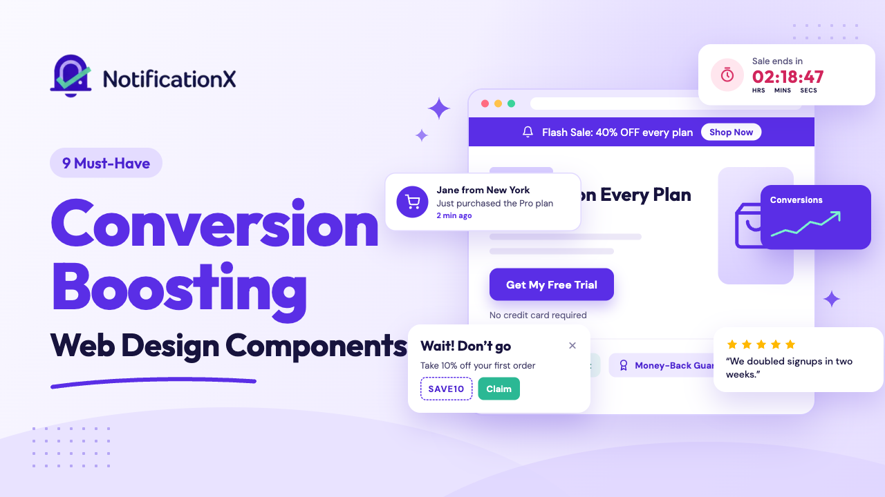
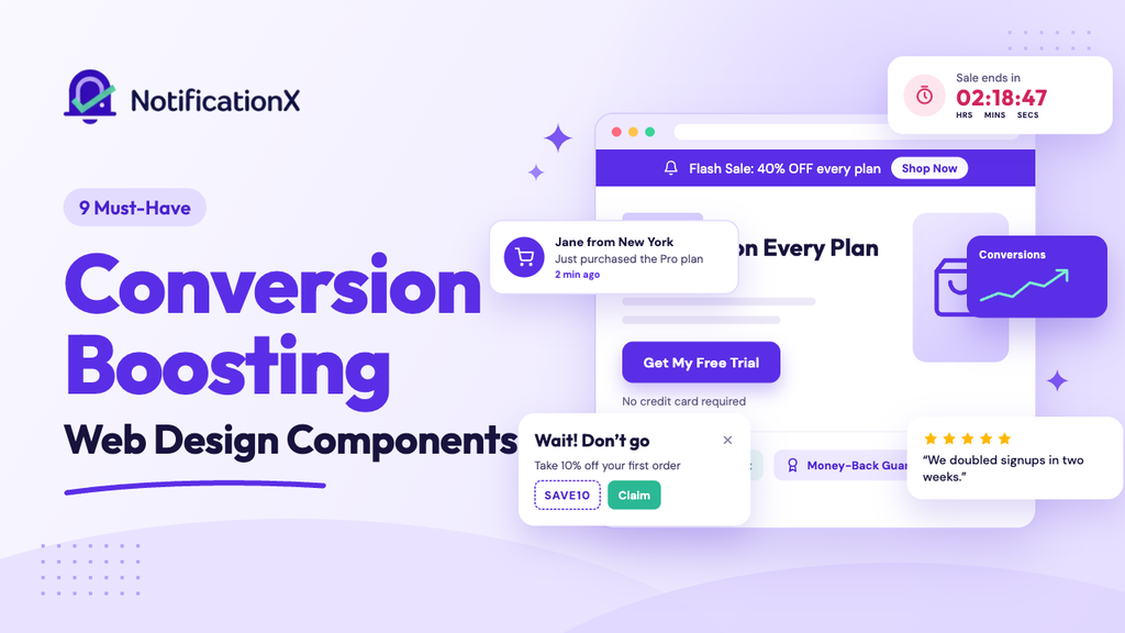
For marketers and business owners, the right conversion-boosting web design is not about looking pretty. It is about guiding every visitor toward one clear action. In this guide, you will learn the nine web design components that lift results on any sales campaign, and how tools like NotificationX help you add the trickiest ones without writing a single line of code.
A Quick Summary (TL;DR)
Traffic alone does not make sales during a campaign. The right web design components do. Here are the nine that matter most:
- Benefit-driven headline: Most visitors read only the headline, so state the value clearly and match your ad’s promise.
- Strong hero section: Use a clean, fast-loading visual that shows the offer before visitors scroll.
- Single, focused CTA: Give visitors one clear action, with reassurance like “No credit card required.”
- Social proof and live sales notifications: Show real-time purchases and signups to build trust and momentum.
- Trust badges: Place security and guarantee signals near checkout, where hesitation peaks.
- Countdown timer: Create honest urgency for offers that truly end.
- Notification bar: Keep your key sale message visible across every page.
- Customer testimonials: Feature specific, results-driven reviews near your CTA.
- Exit intent popup: Recover leaving visitors with a last-minute offer.
Why Web Design Components Decide the Success of Your Sales Campaign
Before we get into the list, it helps to understand why these components matter so much. Visitors form a trust judgment about your website in about 50 milliseconds, which is faster than conscious thought. That means the visible cues on your page decide whether someone stays or leaves.
The numbers back this up. Well-built landing pages convert far better than standard signup forms, and pages built with a single focus outperform pages crammed with many offers. Small elements carry real weight too. According to Flint, placing सामाजिक प्रमाण below a call-to-action can lift conversions by up to 68%, and adding trust badges near a checkout can boost completion rates by as much as 42%.
Each component below plays a specific role in reducing hesitation and pushing visitors toward a purchase.
1. A Clear, Benefit-Driven Headline
Your headline is the first thing almost every visitor reads. Up to 80% of people who land on a page read the headline and nothing else, so it has to do a lot of work in very few words. A strong headline states the benefit, speaks to a real need, and removes any confusion about what you are offering.
Keep it short and specific. Instead of a vague line like “Welcome to our summer event,” write something that names the value, such as “Save 40% on Every Plan This Week Only.” Headlines that include specific numbers and clear benefits can raise click-through rates dramatically. During a sales campaign, your headline should match the exact promise made in the ad or email that brought the visitor in. That consistency reassures people they are in the right place.
2. A Strong Hero Section
NS hero section is the area a visitor sees before scrolling. It usually holds your headline, a short subheadline, a supporting visual, and your main button. Because people retain far more of what they see than what they read, a clear hero image or short video does a lot of the selling for you.
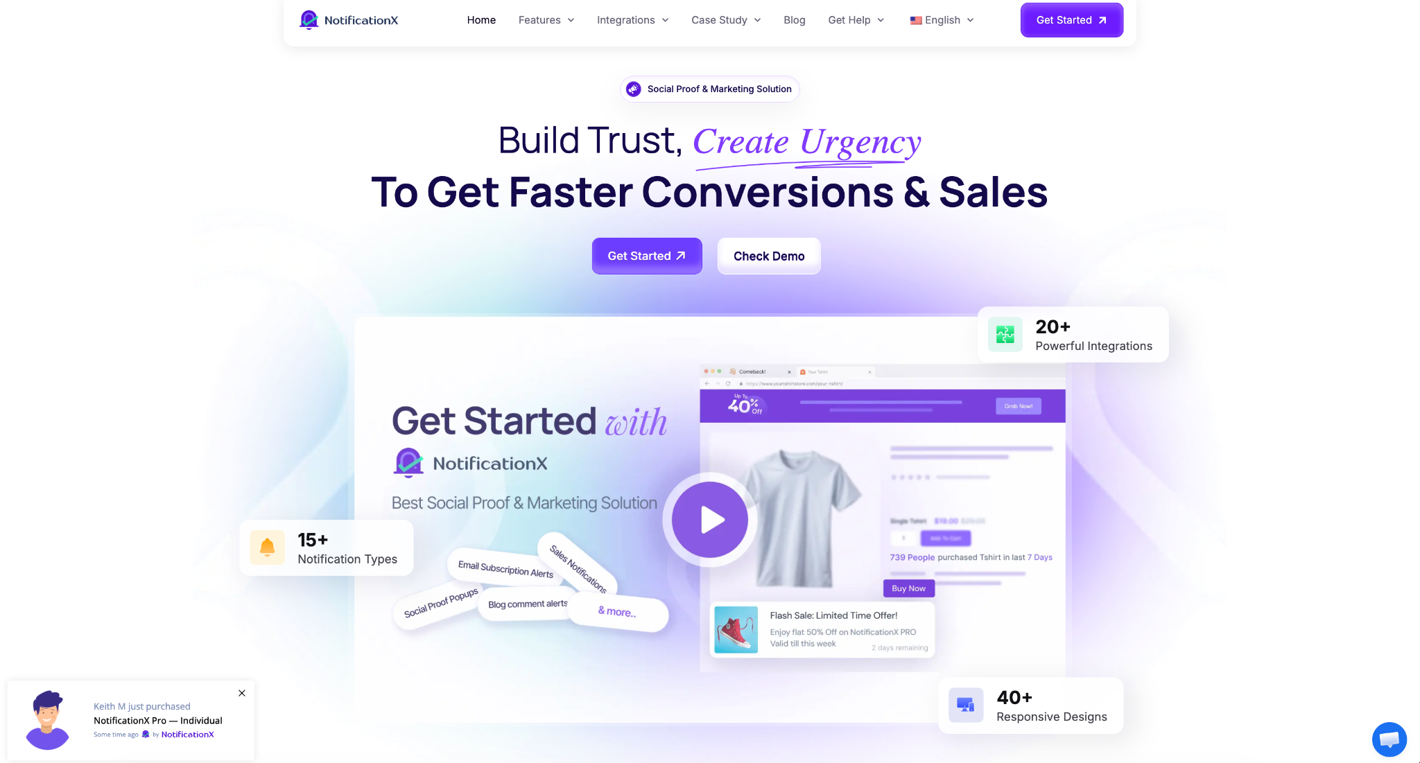
Choose visuals that show the product in action or illustrate the offer directly. Product-specific, clutter-free images work better than generic stock photos. Video can be especially powerful and has been shown to increase conversions when it explains the offer quickly. Just make sure the media loads fast, because a slow page pushes visitors away before they even see your message. A clean, focused hero section sets the tone for the entire sales campaign in seconds.
3. A Single, Focused Call-to-Action
Every page in your campaign should point toward one action. That is the job of the call-to-action, या CTA. When you give visitors too many choices, they often choose nothing at all. A focused page with one clear goal converts better than a page pulling people in several directions.
Make the button copy short, specific, and benefit-led. “Get My Free Trial” beats a plain “Submit” every time. The context around the button matters as much as the button itself. Adding a simple line of reassurance under the CTA, such as “No credit card required” or “Cancel anytime,” can produce a major lift in conversions.
Pair that with सामाजिक प्रमाण placed right beside the button, and you reduce hesitation at the exact moment people decide. Remove distractions like extra menus and competing links so nothing pulls attention away from that one action.
4. Social Proof And Live Sales Notifications
People trust the behavior of other people more than they trust marketing claims. That is why सामाजिक प्रमाण is one of the most reliable conversion-boosting web design components you can add. Real-time activity notifications alone can lift conversions by 10% to 15% on average, and much higher for some stores.
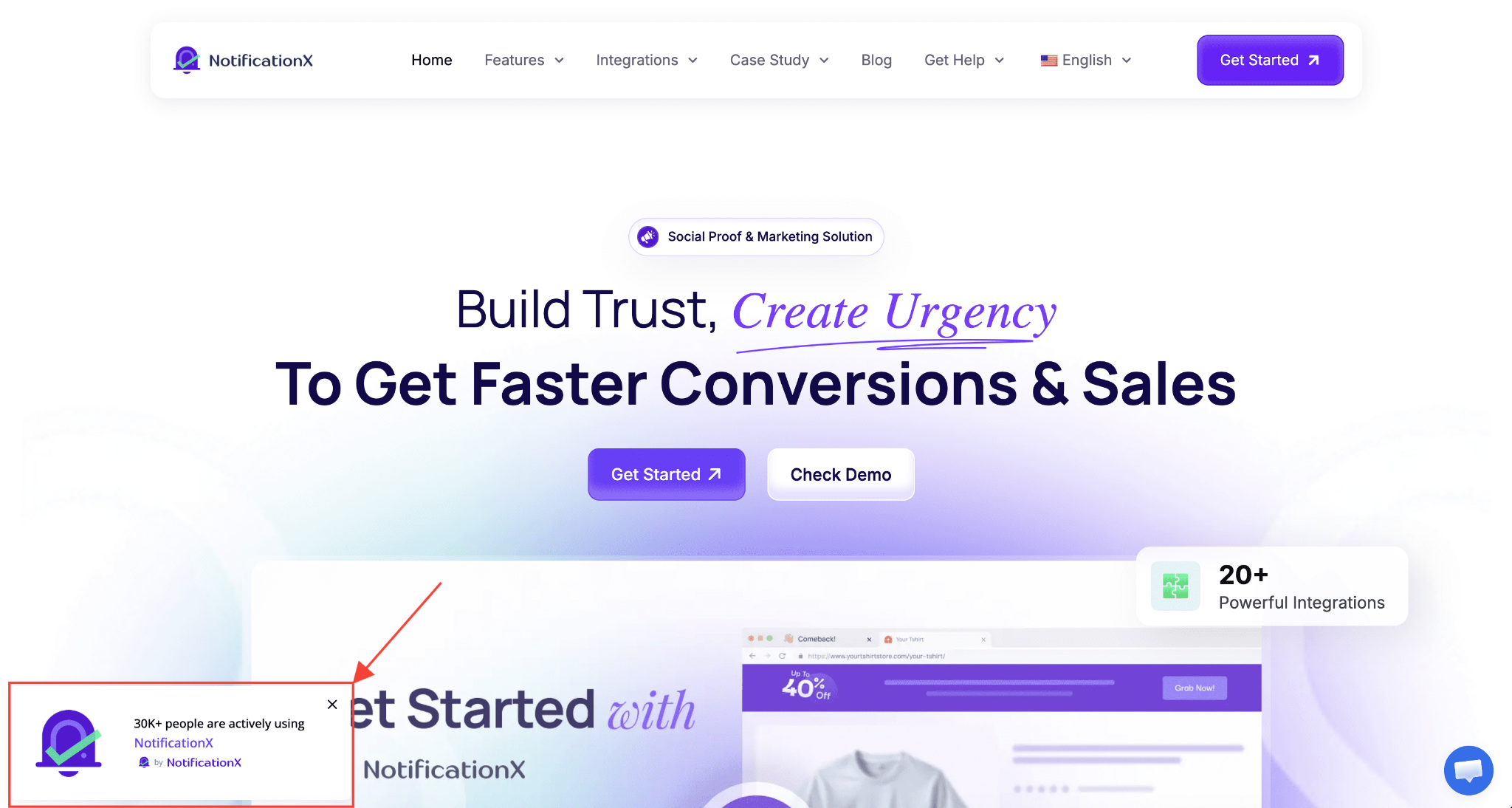
This is where NotificationX becomes a natural fit. With live sales notifications, you can show visitors that other customers are buying, signing up, or leaving reviews right now. Each real action becomes a trust signal for the next visitor, which builds momentum during a busy sales campaign.
NotificationX also integrates with tools like WooCommerce, so every purchase can automatically turn into fresh proof on your pages. To see just how strong this effect is, take a look at these social proof statistics that break down the latest data on buyer behavior.
5. Trust Badges And Security Signals
When money changes hands, doubt goes up. Many shoppers abandon a purchase simply because they do not feel comfortable sharing payment details. Trust badges and security signals answer that fear directly and quietly. Adding them near a checkout or payment area can boost conversions by a wide margin.
Use clear signals such as secure payment icons, money-back guarantee badges, and independent review scores. Placement is important. Keep security badges close to form fields and payment buttons, where hesitation peaks.
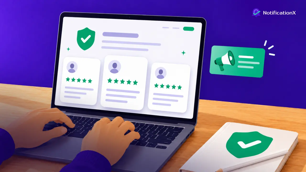
Third-party review badges from trusted platforms often carry more weight than self-reported claims, so display them where people are about to commit. These small trust signals remove friction and make the final step feel safe.
6. A Countdown Timer That Creates Urgency
Urgency works because the fear of losing something is roughly twice as strong as the pleasure of gaining it. A well-placed countdown timer taps into that feeling and gives hesitant visitors a reason to act now instead of later. उलटी गिनती टाइमर and limited-time offers consistently boost completion rates during sales.
The key is to keep urgency honest. Reserve a countdown timer for offers that truly end, because fake scarcity that resets over and over damages trust. NotificationX makes this easy through its Discount Alerts feature, which lets you pair a deadline with a coupon code and display it right where visitors will see it.
If you want ideas before you build one, these countdown timer examples show how real brands use them well. You can also read more about the psychology behind it in this guide on urgency bias.
7. A Notification Bar for Key Announcements
During a campaign, your most important message can get lost as visitors scroll and skim. A अधिसूचना बार solves that by keeping a single, sticky message in view no matter where people are on the page. It is one of the simplest ways to promote a sale, a deadline, or a new offer across your whole site at once.
A good अधिसूचना बार stays visible without blocking the content people came to read. You can use it to announce free shipping, a flash sale, or a limited discount, and you can add a button that sends visitors straight to the offer.
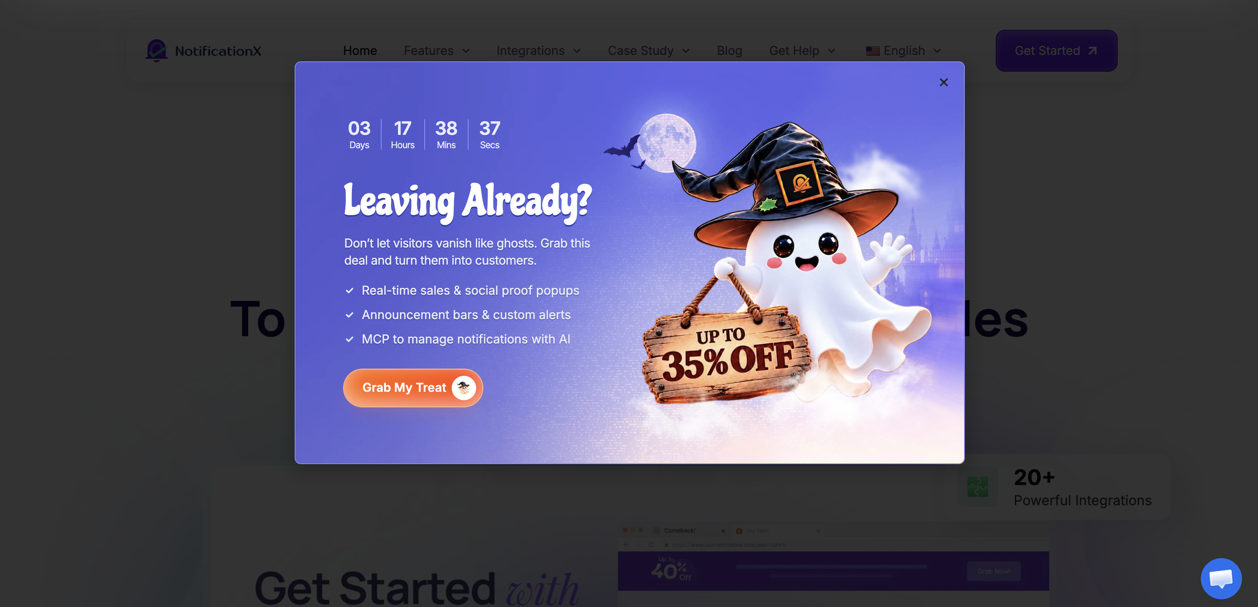
The NotificationX अधिसूचना बार lets you set start and end times, add a call to action, and track how the bar performs with built-in analytics. That means you can promote your sales campaign everywhere without cluttering the design.
8. Customer Testimonials and Reviews
Alongside live activity, static proof still carries huge weight. Nearly all shoppers read reviews and testimonials before they buy, and products with five or more reviews are far more likely to be purchased. Yet many marketers still leave customer testimonials off their pages, which means adding them is often a quick win.
Feature testimonials that include specific, measurable results rather than vague praise. A quote that mentions a real outcome, such as “We doubled signups in two weeks,” is far more convincing than “Great product.” Video testimonials perform even better and can lift conversions well beyond text alone.
Position your strongest testimonials near the CTA, where people make the final decision, and keep client logos or star ratings visible in the hero section for instant credibility.
9. An Exit Intent Popup
Most visitors who leave your website never come back. An exit intent popup gives you one last chance to keep them. It appears at the moment someone shows signs of leaving, such as moving the cursor toward the close button, and delivers a timely offer before they go.
This works especially well during a sales campaign, when a small nudge can recover a hesitant buyer. You might offer a discount code, a free resource, or a reminder about a deadline.
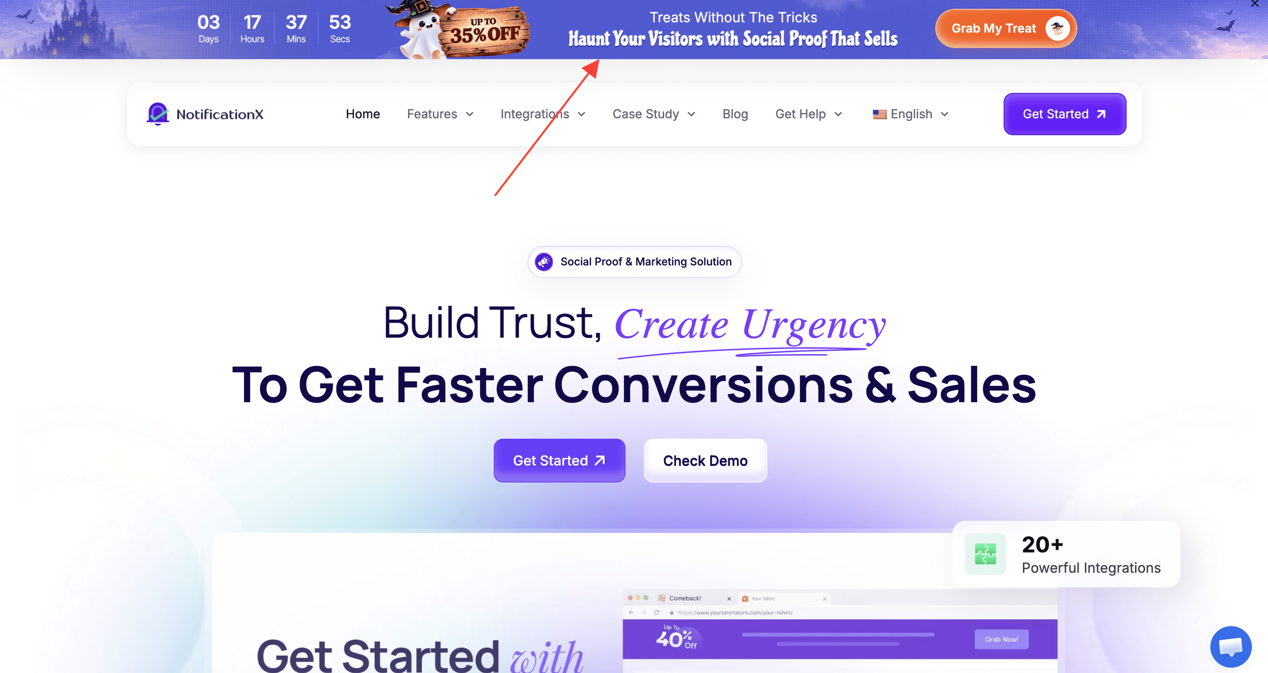
NotificationX includes an exit intent popup feature that lets you design, target, and time the message without any coding. Keep the offer valuable, the copy clear, and the design mobile-friendly so it helps rather than annoys. Done right, it turns lost traffic into real conversions.
Build These Components Faster With NotificationX
Adding all nine components by hand can feel like a technical project, especially the ones tied to trust and urgency. This is where a single tool saves you a lot of effort. NotificationX brings सामाजिक प्रमाण, live sales notifications, a countdown timer, a अधिसूचना बार, and an exit intent popup into one plugin built for WordPress. You can design each element visually, control who sees it and when, and track results with clear analytics.
Because it works alongside page builders like Elementor and integrates with popular stores and forms, you can layer these conversion-boosting web design components onto your existing pages without rebuilding anything. That lets you launch a sales campaign faster and spend your time on strategy instead of setup.
Turn Your Next Sales Campaign Into Real Conversions
A high-converting page is rarely the result of one clever trick. It comes from several web design components working together. A clear headline तथा hero section capture attention. A focused CTA, सामाजिक प्रमाण, trust badges, तथा customer testimonials reduce doubt. A countdown timer, अधिसूचना बार, तथा exit intent popup create urgency and recover visitors who almost slipped away.
Start with the components that fit your goal, test your message, and improve from there. If you want a simple way to add the trust and urgency elements to your WordPress site, get started with NotificationX and turn more of your campaign traffic into sales.
Was this blog helpful? Do not forget to हमारे ब्लॉग को सब्सक्राइब करें. If you want to talk more about marketing strategy, join our फेसबुक समुदाय today.


 English
 Arabic
 Indonesian
 Spanish
 Portuguese
 German
 Dutch
 Russian
 Hindi
 French
 Japanese
 Chinese
 Vietnamese
 Malay